Dogtag
Dogtag
Dogtag is a game that combines cute dogs, Los Angeles satire, and silly wit. It's supposed to be both fun and funny, and does its best to use its voice and tone to be just as fun to talk about as it is to play.
I was brought on after the mechanics and art for the game were finalized. My responsibilities were to create the product box, design the manual for the game, and create the website.
After the launch and success of Dogtag the game, I was tasked with expanding the brand of the game to encompass a larger social media presence, branding, and promotional materials. The goals of the redesign were:
Maintain the friendly, self aware wit of the game
Dogtag is a character focused brand - they are the “content creators” of Dogtag and branding and materials should embrace that
The brand should work well in a template system for content, so the main bottleneck for new content would be the words and text, not having to create new visuals
The logo was redesigned first. Keeping in line with the design goals, the new logo is the name Dogtag in Klasik font with an accompanying colored shadow. The base colors are blue and pink, main colors that were pulled from Dogtag the game. However, these colors could be changed to fit the look of an everchanging colors scheme.
@dogtagthegame
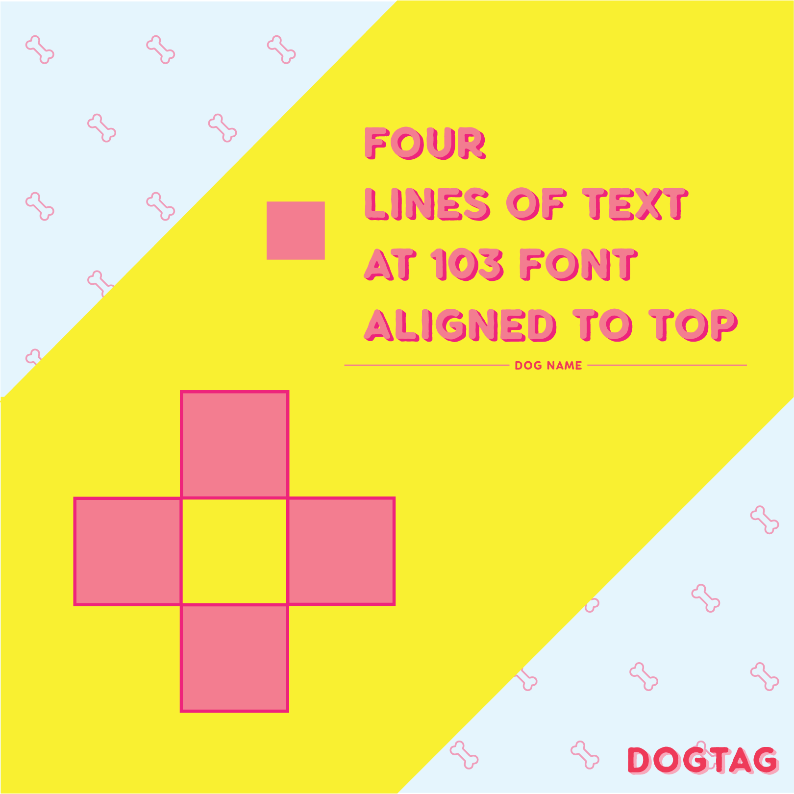
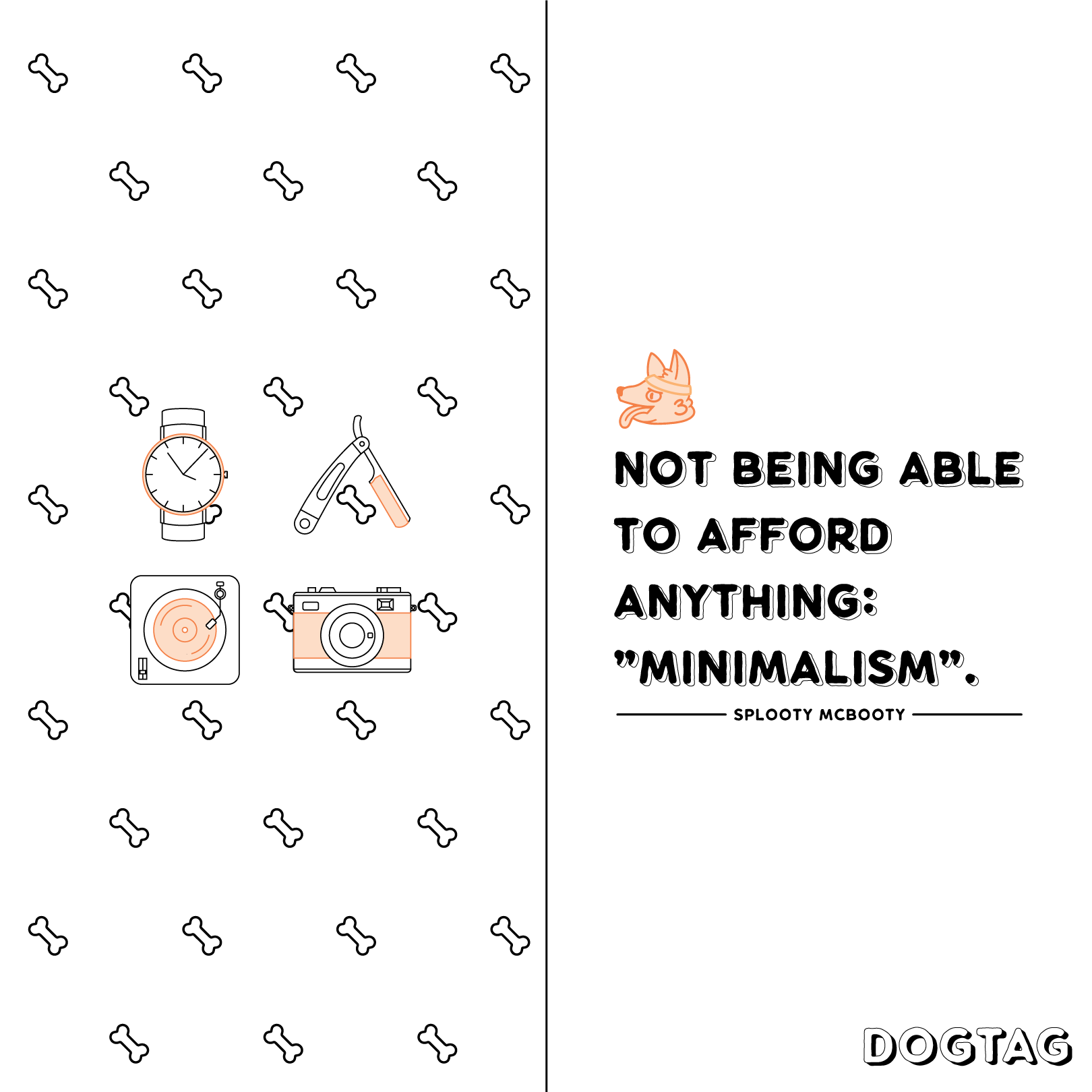
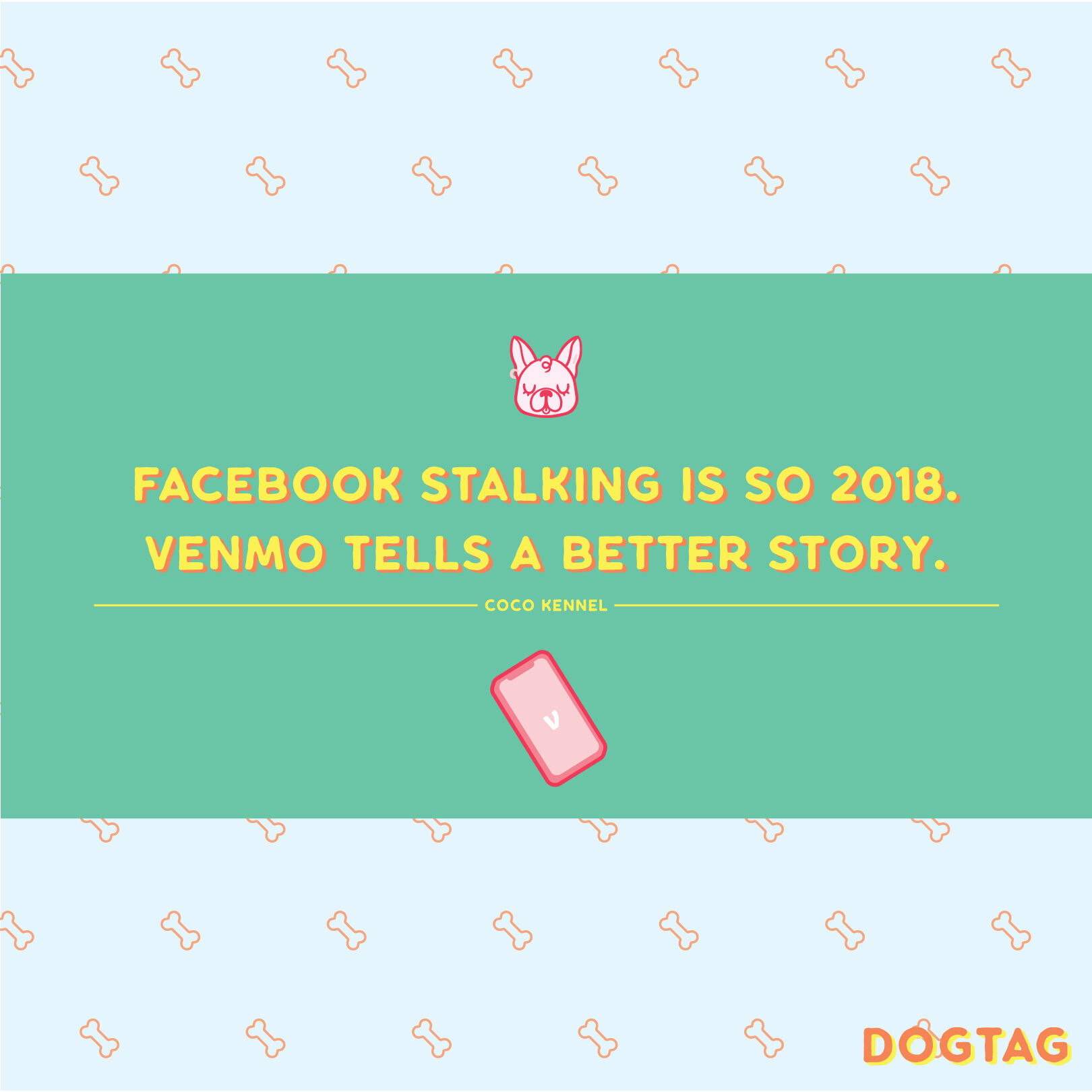
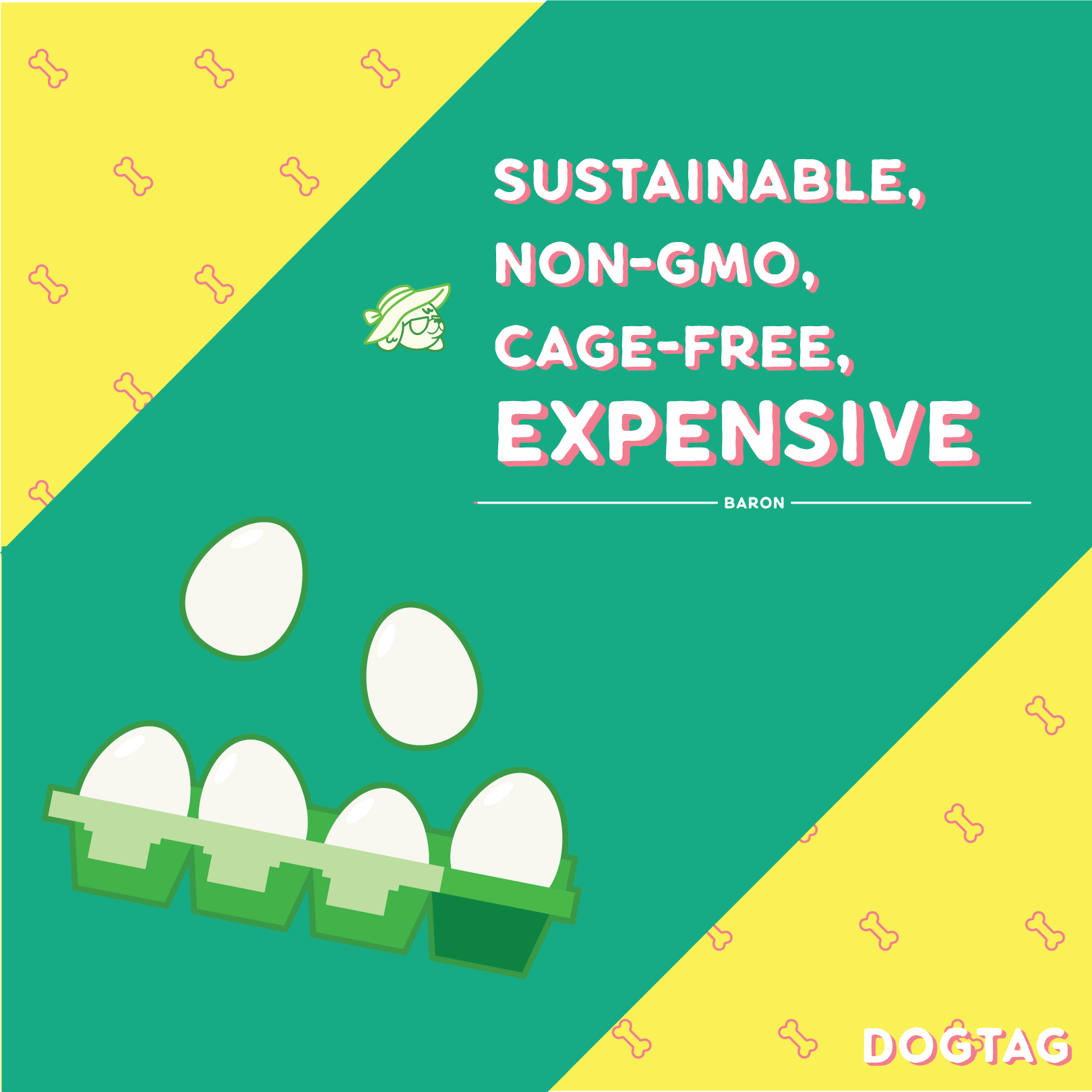
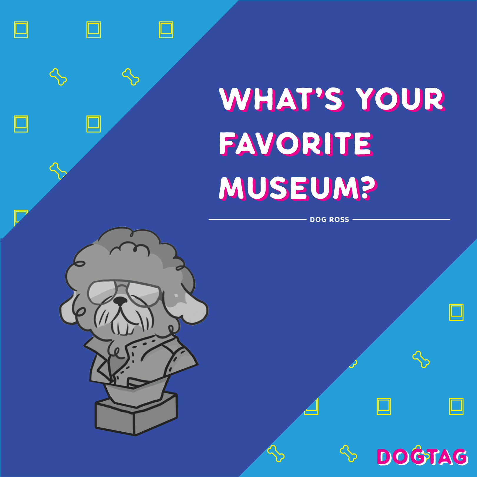
The template system was created to showcase the voice of the brand, which is derived from the voice of the characters of Dogtag. They were designed to be cohesive in shape and structure, but also fit the needs, voice, and content of the character being showcased. Four initial templates, iconography for the characters, and a very loose set of color guidelines set the groundwork for a near infinite amount of posts, removing the fabrication of the post as a bottleneck from the system.


