Pathfinder
Pathfinder
Context
Pathfinder is an app that acts a navigation tool for specific rooms and locations within buildings and enclosed locations. The project originally started as a concept for the 2014 CMYK Designathon at UC Berkeley alongside Anna Cheng, Bianca Romulo, and Avery Yoon. Teams were tasked with coming up with solutions to increase accessibility on campus.
Initial Research
We had brainstormed several different ideas, each tackling the idea of "accessibility" from a different direction. In the end, we decided to tackle the obvious problem of, "Getting to Dwinelle is easy. Getting to 4811 Dwinelle is hard as hell."
This hypothesis was confirmed through interviews with other students at the designathon about their experiences finding classroom on the Berkeley campus. In the majority of interviews, students agreed that finding the building itself was not difficult thanks to online resources and maps available throughout campus.
However, theses same resources rarely had any details about building interiors and specific classroom locations. Even the maps in the buildings themselves were often said to be difficult to interpret.
Design Goals
In the end, we decided to create an app that provides students interior maps of each building on campus, which we could get away with due to the constraints of the prompt being limited to the UC Berkeley campus.
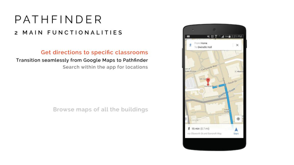
Our product would have two core experiences: providing navigation to a specific location and providing a resource of the maps of each building themselves.
Prototype
One of the main problems of maps of interiors is that there are different floors levels, so we had to make sure our visuals could convey levels and depth throughout interiors. We wanted to make sure moving through different floors was easily understood while using Pathfinder to navigate through a building. Flipping between isometric maps for vertical movement and traditional flat x-y plane maps for single floor navigation made sure users understood where in the building they were.
For the campus locations themselves, we set up a grid of the different buildings, as in the context of this product, only the buildings on the UC Berkeley campus would be included.
Post Designathon Changes
After receiving feedback from both the judges and our peers, I would make the following changes to Pathfinder given the chance.
- There needs to be more guidance throughout the app. Even with only a few basic functionalities, the user experience in the initial design of Pathfinder is still a bit confusing. The "Where?" was confusing for users as they did not know what they were able to search in the app. Buildings? Locations? Rooms? All of the above?
- The user interface is extremely bare bones as a result of the time limit of the competition. Fixing this would help a lot of the confusion on the user experience side.
- Text directions would be the biggest feature to add in the app. This was one of the constants in the feedback we received, such as "turn right at the next corner" or "take the elevator on the left to the 3rd floor."
We also won 2nd place ayy


